Mobile usability & layout audit
Site and scope
Opera Memphis, tested September 27–28, 2026. WordPress 7.1.2, Elementor 4.3.2, Elementor Pro 4.1.1, Memphis child theme. This was an automated browser test with visual review and live remediation, not a participant study or a full WCAG certification.
The most consequential defects were the open menu retaining its old dimensions after phone rotation and several anchor links landing behind the header. Both were corrected. Small buttons, supporting text, carousel controls, and an overflowing volunteer form were also improved.
Coverage
- All 35 published WordPress Pages were inventoried. Thirty public pages received responsive measurements and screenshots. Five rental pages redirect visitors to login and could not be assessed as public content.
- The audition notice, current Season, Events, and Productions views were also checked. Total: 34 public views and 618 final viewport measurements, plus targeted behavior tests.
- Full 28-width ladder on Home, Tickets, and Ways to Give: 2560, 1920, 1728, 1536, 1512, 1440, 1367, 1366, 1280, 1200, 1180, 1025, 1024, 900, 820, 810, 800, 768, 767, 430, 414, 402, 393, 390, 384, 375, 360, 320px.
- Other public pages and the audition notice: 18 widths, including the complete desktop/laptop range, both sides of 1024/1025 and 767/768, and 430/390/375/320px phones.
- Season and event archives: 10 widths from 1920 to 320px. Portrait and landscape menu behavior received separate tests.
- Chromium provided the broad sweep. WebKit passed menu tests at 320, 390, and 844px, plus 22 same-page anchor tests at 390px. These are browser-engine/emulated viewport checks, not tests on physical iPhones or Android devices.
Desktop and laptop recheck
Measured shared header content geometry on Home after the mobile changes:
| Viewport | Content width | Left/right gutter | Horizontal overflow |
|---|---|---|---|
| 1200 | 1140 | 30 | None |
| 1280 | 1220 | 30 | None |
| 1366 | 1306 | 30 | None |
| 1367 | 1307 | 30 | None |
| 1440 | 1320 | 60 | None |
| 1512 | 1320 | 96 | None |
| 1536 | 1320 | 108 | None |
The desktop navigation returns when resizing above 1024px. The existing desktop indicator hiding and spacing remain intact. No tested public view reported horizontal document overflow.
Fixes and measured results
| Element | Before | Change | Verified result |
|---|---|---|---|
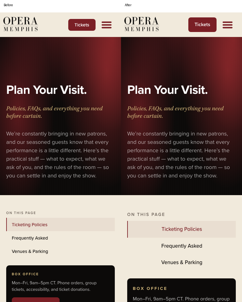
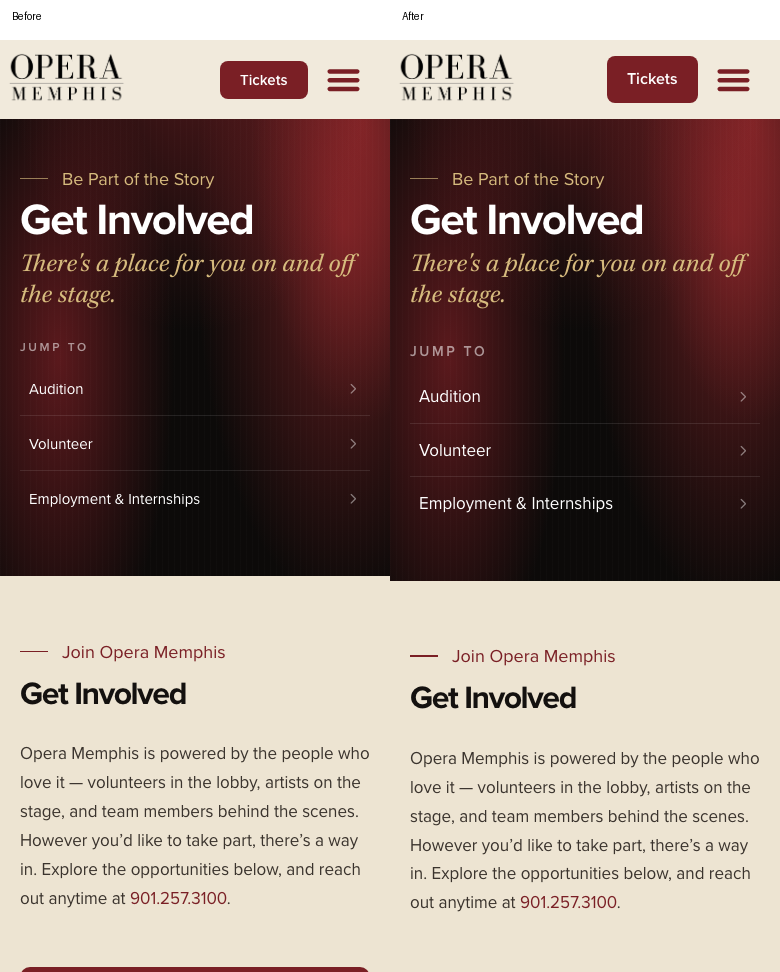
| Header Tickets button, 58/ommbdon | 15px text, 38px high | Native responsive type 16px/1.4; 12px vertical padding | About 46.4px high; 10px gap to hamburger |
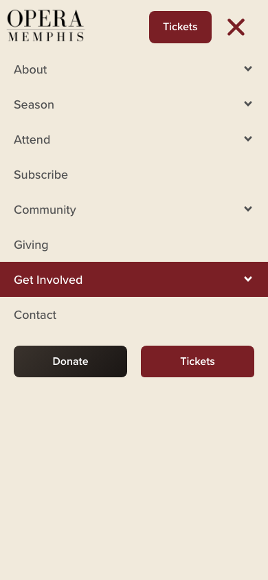
| Mobile menu action row, 58/6a14493 | 15px text, 44px high | Existing menu-action CSS to 16px/1.4 | 46.4px high; equal 165px columns at 390px; 20px outer gutters and center gap; directly below Contact |
| Main menu links | Already 18px with 51px rows | Retained | All five parent submenus open; hover label and arrow both white |
| Tablet hamburger | 28px icon, 42px target | Native size 30px | 45px target; phone target remains 52.5px |
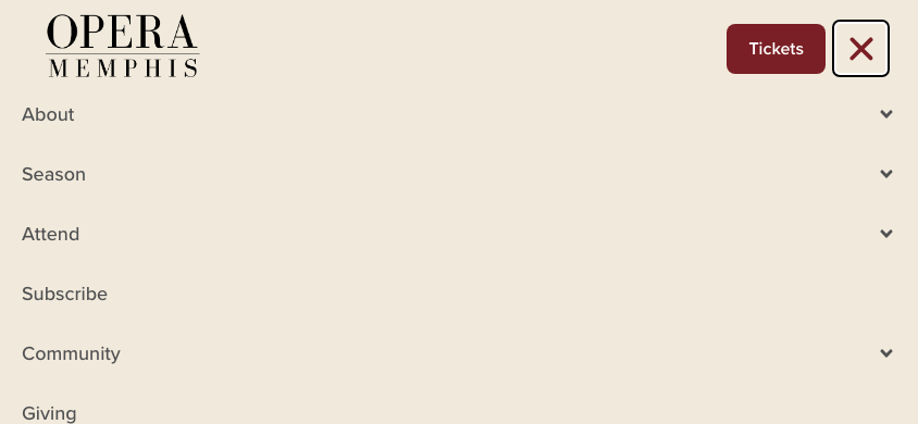
| Open mobile panel | Stale height and horizontal offset after rotation | Scoped resize recalculation | At 844×390: x=0, width=844, bottom=390. At 430×932: x=0, width=430, bottom=932 |
| Menu keyboard close | Escape left panel open | Escape closes and focuses toggle | Passed Chromium and WebKit |
| Plan Your Visit quick links, 8944 | 15px text; only text was clickable | Converted three heading links to native full-width Button widgets, 17px/1.5 mobile text | Padded row is tappable; about 53.5px tall |
| Jump-to links | 15px mobile text | Native icon-list typography 17px/1.5 | Consistent readable rows on Get Involved, Tickets, Ways to Give, and audition notice |
| Audition quick-link rows | Padding surrounded the clickable link | Moved existing row padding onto anchor; removed conflicting fixed font declaration | Whole row now tappable without increasing section spacing |
| Small labels and supporting text | Several 11–15px labels/body fragments | Native mobile typography: labels generally 14px; supporting body text 16px; 1.5 line height | Read back and visually checked; large display headings retained |
| Staff/board/home listing text | Role/date/name text 13.5–15px | Native JetEngine/heading typography 15–16px with 1.5 line height | More readable labels; compact homepage card retained |
| Secondary buttons | 12–15px text; some only 17px tall | Native mobile text 16px/1.4 and 12px vertical padding | Previously short Tickets card buttons no longer flagged as under 44px |
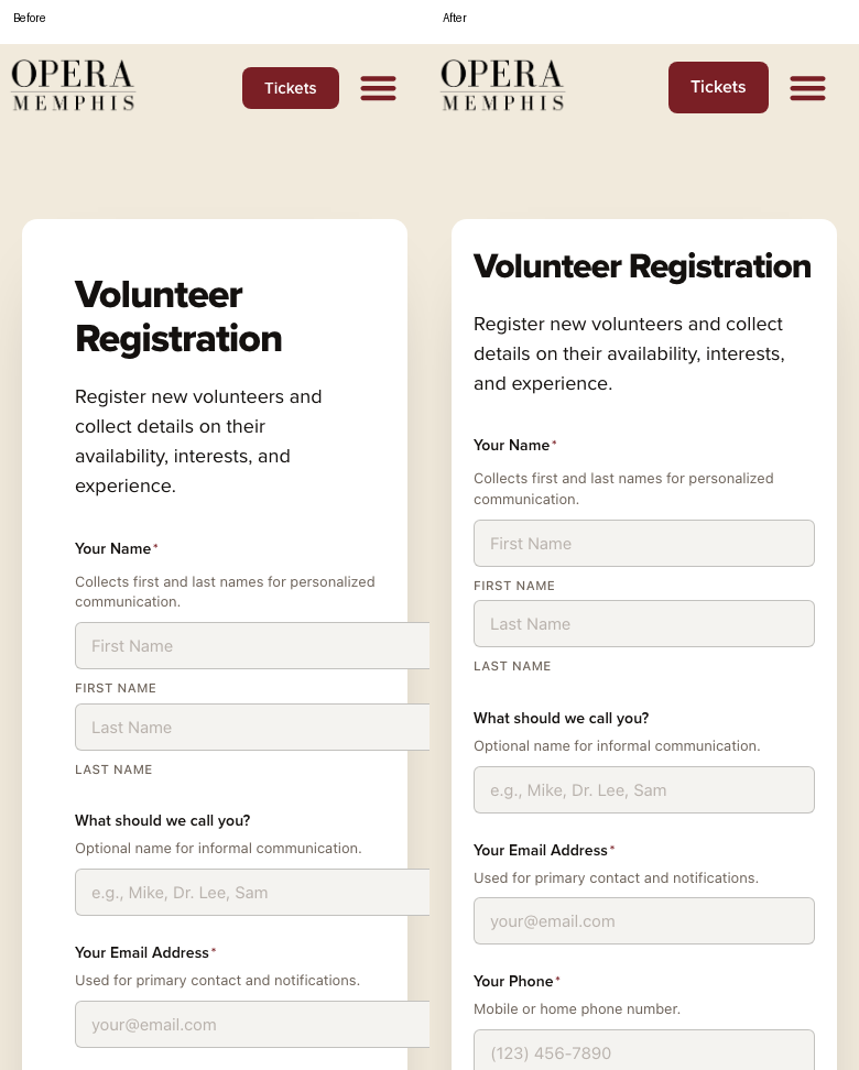
| Volunteer Registration, 5438 | Fields extended beyond white card | Native card padding/heading adjustment; scoped single-column form grid and bounded inputs | Input right edge equals content right edge at 320/375/390/430px; balanced inner padding |
| Three community carousel arrow pairs | 30px targets | Native 44px arrow size; scoped pair separation | 44px targets and measured 20px gap at 320/375/390/430px |
| Tickets “Plan Your Visit” CTA | Linked to #boxoffice | Native link changed to /plan-your-visit/ | Actual click reaches the correct page |
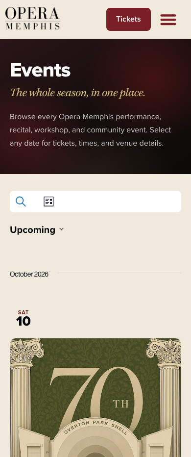
| Calendar search/view/date controls | 29px/29px/33px high | Existing plugin stylesheet: minimum 44px targets and separated search/view controls | 44px on 320/390/430px; search, view selector, and date picker open correctly |
Exact document IDs, element IDs, new values, and CSS exceptions are in the three native-changes*.json files. Complete original Elementor JSON for every edited document is saved in the live companion backups. These permit reversing individual changes without restoring the entire site.
Anchor and navigation behavior
- All 22 remaining same-page navigation links were tested at 320, 375, 390, 430, 768, and 1440px: 132 successful checks. The separately corrected Plan Your Visit CTA was tested as a page navigation.
- Same-page targets land at header height plus approximately 20px, within rounding tolerance. Plan Your Visit previously landed at approximately 0px from the viewport top.
- Cross-page policies and contact-form anchors were tested at four phone widths. They land approximately 16px below the header, using the site's existing cross-page handler.
- All 25 internal menu destinations returned successful responses. The external donation link is preserved; no payment transaction was attempted.
- The header still retracts on downward scroll and returns on upward scroll. Resizing to desktop closes the compact menu.
- Main menu, action-row geometry, hover colors, Escape, and rotation evidence are saved with this report. No forms were submitted.
Visual evidence
Mobile menu · Landscape menu · Plan Your Visit before/after · Volunteer form before/after · Hero before/after · Calendar controls
Deliberate platform exceptions
| Exception | Why native Elementor controls cannot provide it | Location |
|---|---|---|
| Escape and settled rotation geometry | Legacy Nav Menu has no controls for these behaviors | Theme inc/mobile-navigation.php, included once from functions.php |
| Sticky-header anchor offset | Requires reading actual header height when a link is activated | Existing scoped functions.php anchor handler, extended to verified secondary links |
| Two styled WordPress menu actions | Actions are editable WordPress menu items, not separate Elementor Button widgets | Existing Nav Menu custom CSS |
| Shortcode form grid | Shortcode widget exposes no Gravity Forms field-grid controls | 5438/de6a337 custom CSS, phone-only |
| Centered carousel pair gap | Widget supports size, not the custom centered pair's gap | Existing carousel custom CSS, phone-only |
| Calendar touch targets | Events Calendar archives are rendered by the plugin | Existing om-events.css, phone-only; asset version 1.0.25 |
Conflicting Tickets eyebrow and audition link font declarations were removed so the native responsive settings can work. Audition stylesheet version is 1.3.2.
Remaining findings and boundaries
- Black Roots of Opera, Student Night at the Opera, and Expanding Horizons still display draft placeholder copy. This is a content-readiness issue, not a responsive defect. No replacement copy was invented.
- Space Rental, Orchestra Parts Rentals, Costume Rentals, Set Rentals, and Rental Inquiry redirect to login. Their protected content was not changed or certified.
- The raw probe still flags inline links, intentionally hidden skip links, footer links, small metadata, image upscaling, long desktop lines, and absence of CSS text-wrap properties. It reports repeated findings per viewport, not unique defects. Therefore this report does not claim a zero-finding whole-site WCAG or design audit. The focused navigation defects and regressions introduced by this pass were addressed.
- Some community gallery images upscale on large screens. Replacing source images belongs to a separate media-quality pass.
- Testing covered all published Pages and representative menu-linked template views, not every individual event, production, or blog entry. Checkout, donation transactions, form delivery, and physical-device assistive technology were not exercised.
Quality gate
| Gate | Result |
|---|---|
| Every width on every page | Deliberately trimmed coverage described above; not claimed |
| No public-page horizontal overflow | Passed all 618 final responsive measurements |
| Gutters and laptop dead zone | Directly measured; header and hero navigation alignment checked visually |
| Native controls or documented exception | Passed; exceptions listed above |
| Breakpoint boundaries | 767/768 and 1024/1025 passed |
| Widest tier after mobile changes | Rechecked at 2560/1920px for the page sweep |
| Before/after evidence | Saved for changed components; full data and screenshots remain on the site desk |
| Outside-scope findings retained | Content readiness, protected pages, and media-quality findings recorded above and in PENDING-UPDATES |